This project transformed a template-based gastronomy website into a legally compliant, accessible, and brand-aligned digital experience. The redesign went beyond meeting EU regulations, focusing also on making it easy for customers to discover the bar online and to trust it before their visit.
Duration: 12 weeks
Role: Designer–Developer (UX/UI, Front-end)
Scope: Website Redesign
Tools: VS code, Adobe CC
II. Background
While the original site provided basic functionality, it also introduced several UX and branding issues:
Unnecessary cookies from plugins raised privacy concerns.
Improper use of semantic structure reduced SEO and accessibility.
Lack of accessibility features made the site non-compliant with the new EU accessibility law (effective June 28, 2025).
Weak visual branding failed to reflect the authentic, rustic character of the bar.
Ongoing WordPress updates created unnecessary maintenance overhead.
III. Key Problems & Solutions
I followed a user-centered design process over 12 weeks, from research to tested prototypes.
Poor mobile experience
Problem: The site was not fully responsive, making it difficult for mobile users to access essentials such as opening hours, the menu, or location.
Solution: A mobile-first redesign delivered a lightweight layout with simplified navigation, allowing users to reach key details within just one or two taps.
Information findability
Problem: Long single-scroll layout forced users to hunt for details, creating frustration.
Solution: Introduced a minimal two-section structure (Liesl and Wein) with overlay navigation, making information scannable and easy to access.
Information architecture comparison
Accessibility gaps
Problem: Low contrast, missing alt text, and lack of ARIA roles excluded users with visual or motor impairments.
Solution: Applied semantic HTML, proper heading hierarchy, ARIA roles, and contrast adjustments to meet accessibility standards.
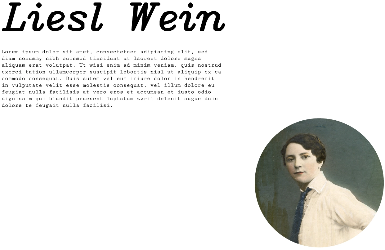
Brand disconnect
Problem: The generic template design did not reflect the authentic, rustic character of the bar, reducing trust before a visit.
Solution: Introduced rustic 90s-inspired typography, logo favicon, and hover interactions revealing the bar’s symbol, aligning the site with the bar’s authentic ambience.
Brand-aligned typography and imagery
Weak calls-to-action
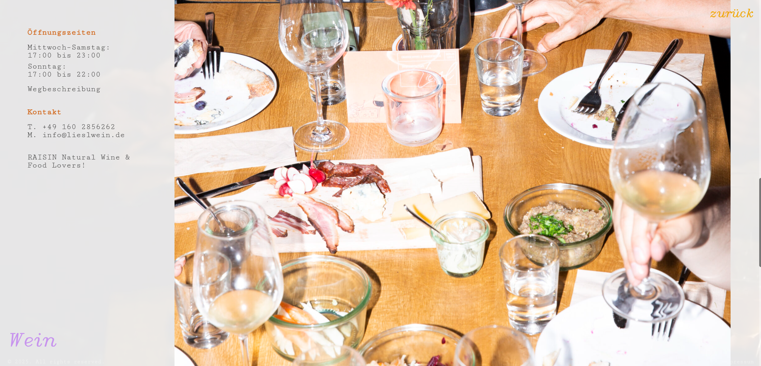
Problem: Phone number and map links were hard to locate, reducing conversions.
Solution: Optimized placement and visibility of contact details and map links to encourage reservations and visits.
Prominent placement of contact and map links reduced friction.
IV. Constraints
Key non-negotiables that shaped scope, architecture, and design decisions.
EU accessibility compliance:
Must meet the new EU accessibility requirements effective
(WCAG-aligned implementation, semantic HTML, contrast, keyboard support, ARIA where appropriate).
No heavy CMS dependency:
Avoid WordPress and plugin ecosystems to reduce maintenance, cookie footprint, and security surface.
Authentic brand expression:
Reflect the bar’s rustic, 90s-inspired aesthetic across typography, motion, and micro-interactions.
Lightweight architecture:
Favor minimal, low-maintenance tech (built with pure static HTML, CSS, and JS) for fast performance and easy upkeep.
V. Outcome & Impact
The redesign delivered measurable improvements across technical performance, accessibility, brand expression, and business results. Below is a concise summary of the key outcomes:
Delivered a cookie-free, lightweight website with no external plugin dependency.
Achieved full accessibility compliance, making the site inclusive and legally future-proof.
Established a stronger visual identity and storytelling, aligned with the bar’s authentic atmosphere.
Reduced maintenance costs and complexity for the client.
Tangible business results
The redesigned site reached an average of 4.6K monthly impressions
and 200 monthly clicks (CTR 4.3%), confirming improved discoverability
and customer engagement.
User experience gains
Mobile visitors could access key details within two taps, while visually impaired users
could finally navigate the site without barriers.
An overview of the final website experience on desktop
Reflection
Beyond measurable improvements, this project reinforced the importance of
accessibility as a design driver. It demonstrated how aligning legal compliance, user needs, and brand
storytelling can produce both social and business value.