Challenge
Desk workers want quiet, 5–10-minute, no-equipment care, but most apps push long workouts and lack a plan-remind-progress loop.
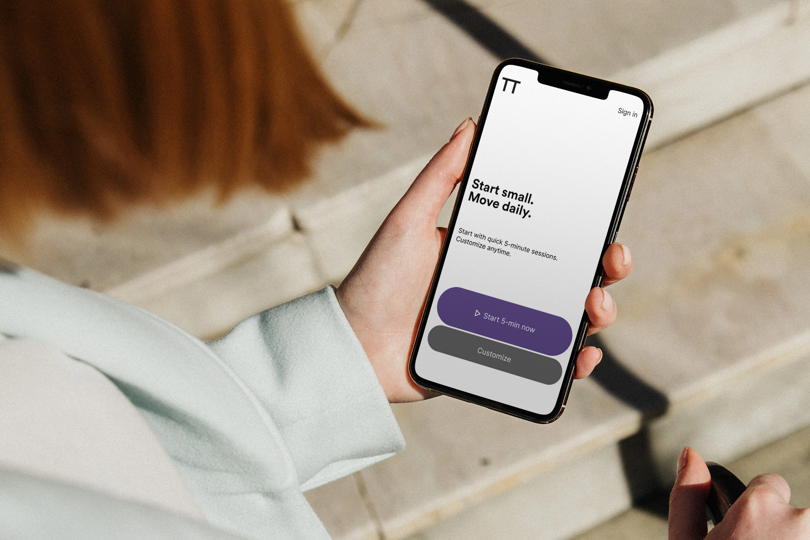
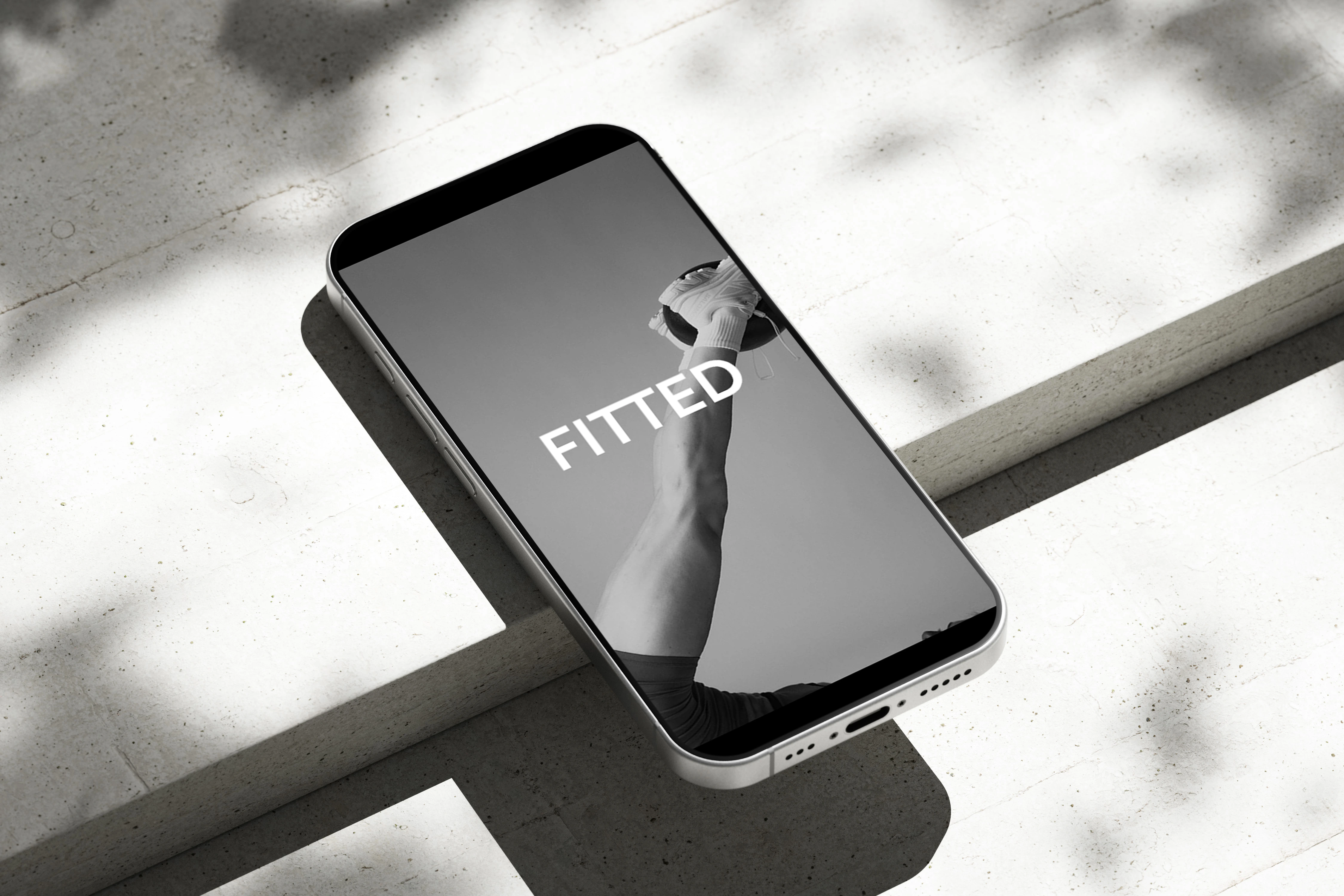
FITTED is a mobile app for 5–10-minute, posture-friendly self-care sessions you can start and repeat easily. From open to action takes under a minute.
Help busy desk workers start short, posture-friendly care without friction, and keep it going most days.
Desk workers want quiet, 5–10-minute, no-equipment care, but most apps push long workouts and lack a plan-remind-progress loop.
Start in under 30 seconds with one clear primary button. Repeat on most days with quiet, small-space routines that improve posture.
Rebecca (34), Software Developer — desk-based, tech-savvy beginner. Needs 3–10-minute, quiet, no-equipment breaks between meetings.

Core insight: In busy moments, users need fast decisions—not more information. So I designed to minimize cognitive load and time-to-action.
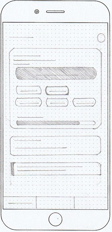
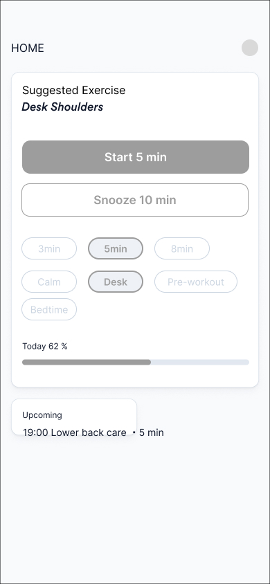
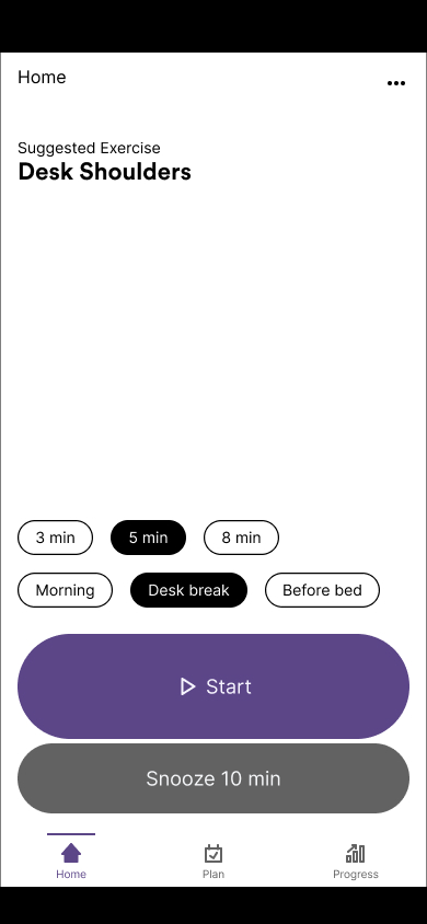
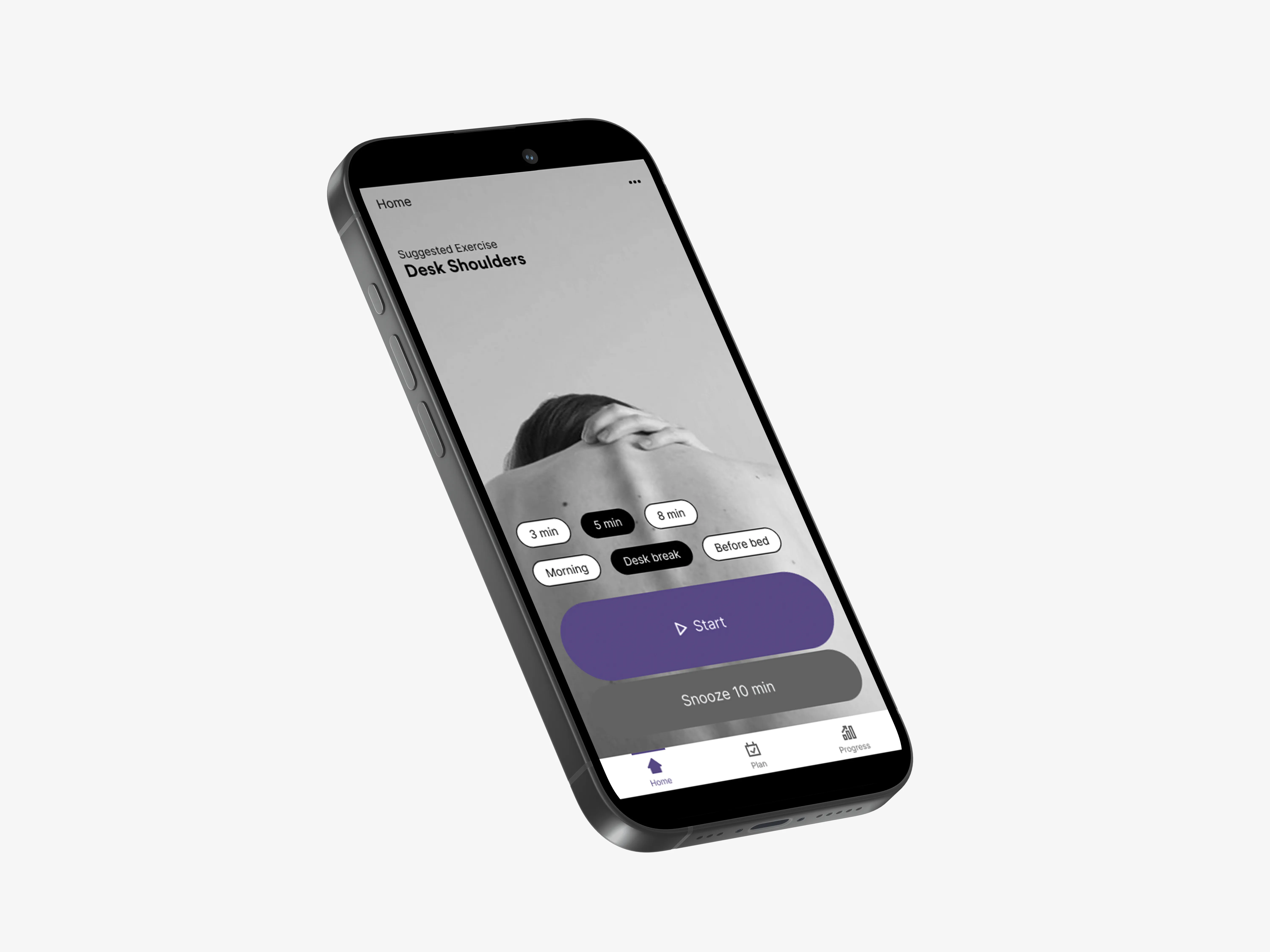
Design target: A single primary CTA on Home keeps time-to-start under 30 seconds.
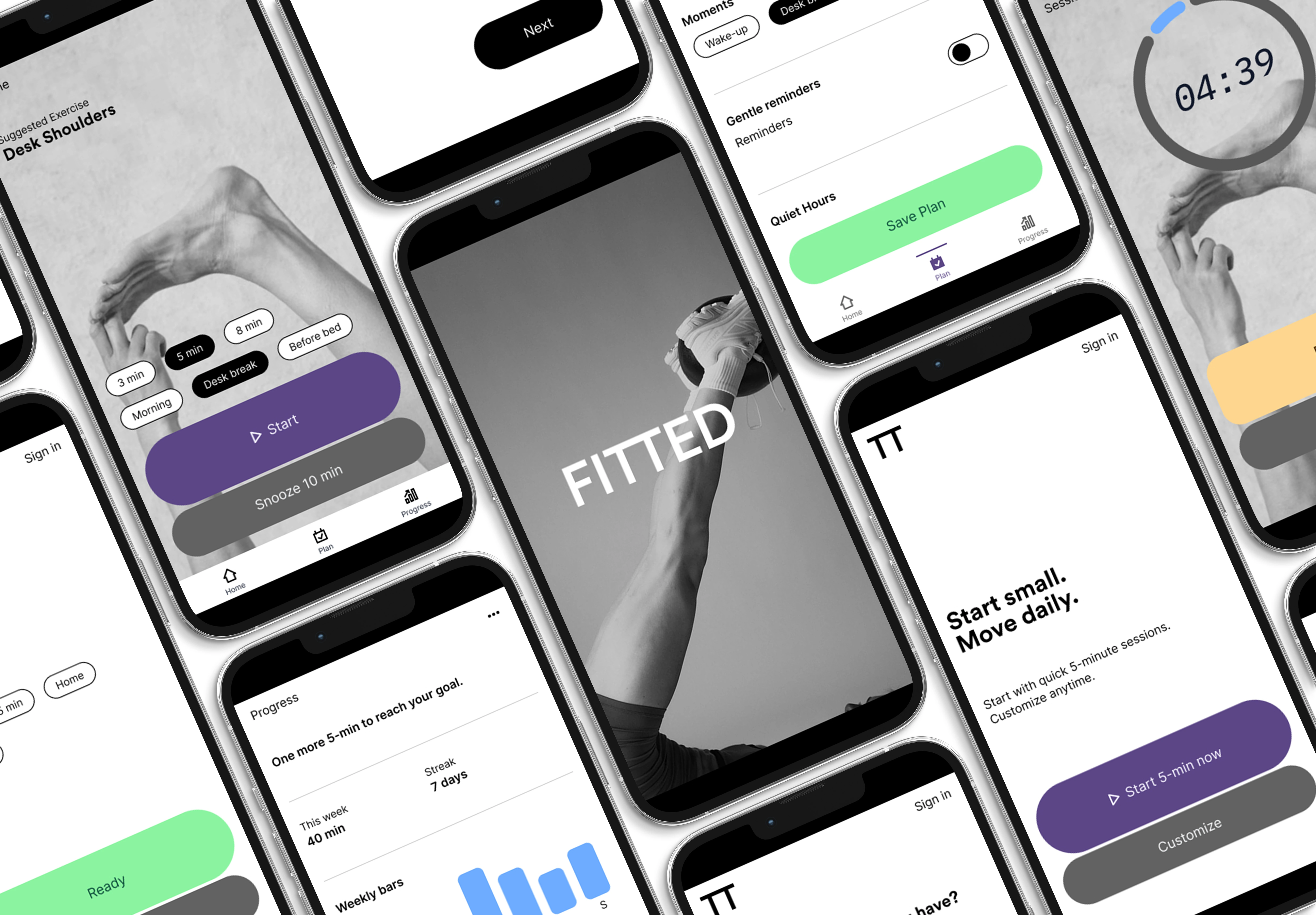
Defined each screen and its connection based on persona scenarios.

Low-, mid-, and high-fidelity flows were created in Figma and iteratively refined.
Calm, readable, role-based color and scalable type.
Type-led, simple by design.
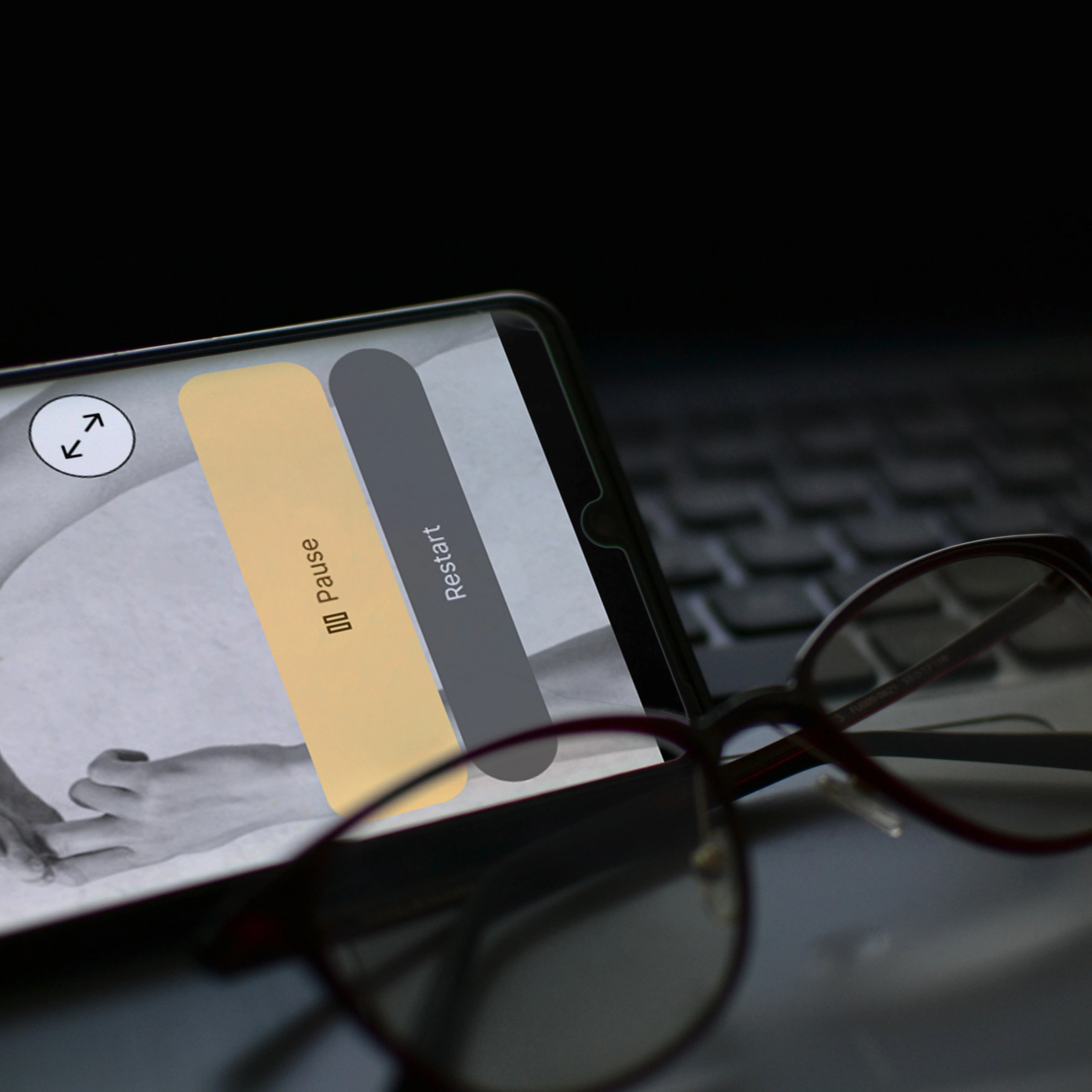
Decisive, accessible contrast for low-attention moments: muted neutrals, a confident purple primary, clear success green, and a soft pause amber for instant state recognition.
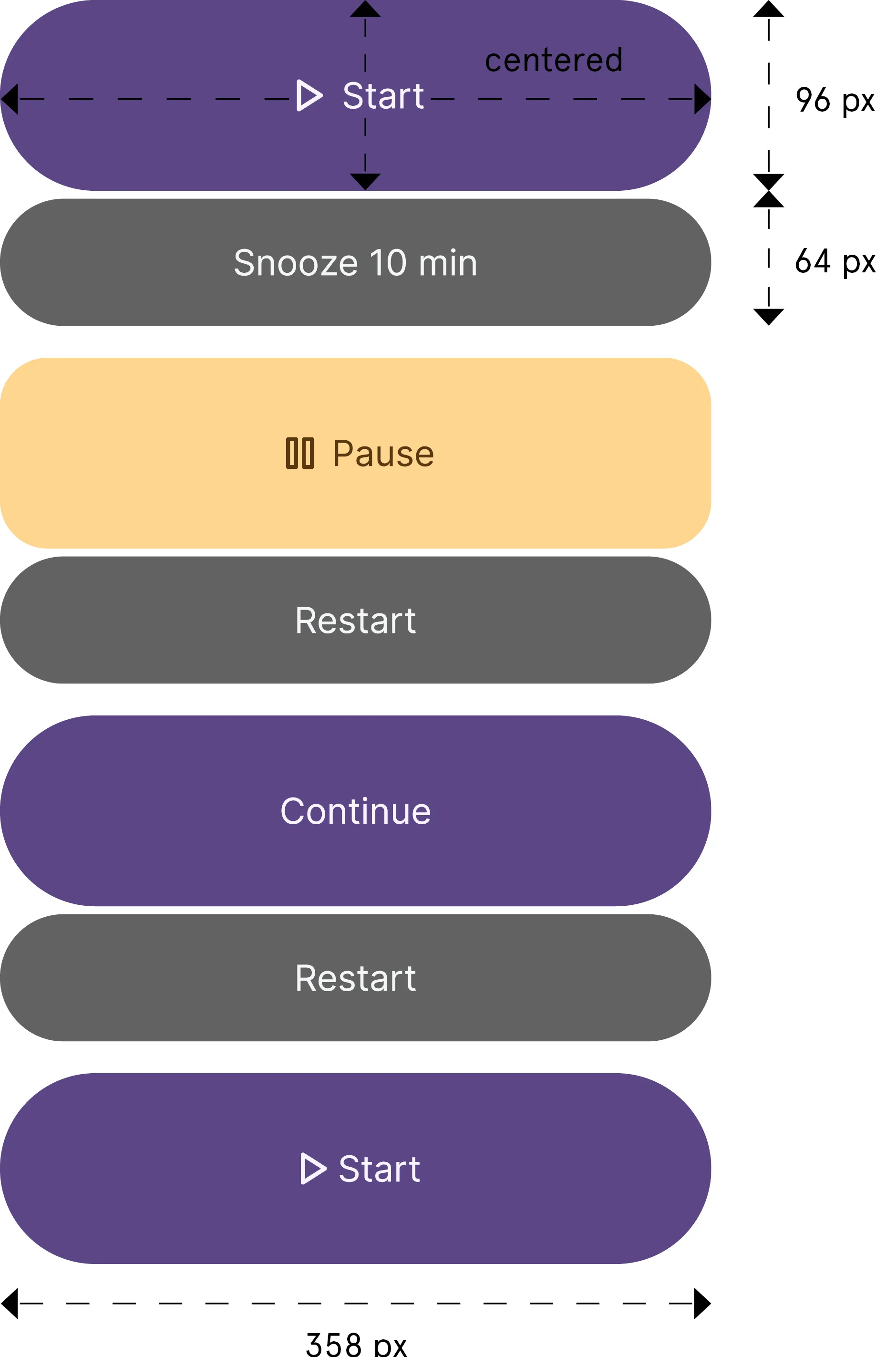
#5c4688. Text: #f7f4ff#626262. Text: #f4f6f8#8af4a1. Text: #0b4b3a#ffd68f. Text: #5a3810Sized for one-handed use. Large primary in the thumb zone for faster, safer taps.
Weight by role. Size by scale. Type leads. Whitespace steadies.
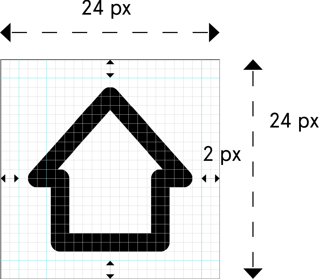
24px grid, 2px stroke, optically centered. Role color only in the active state.
Calm, readable, role-based color and scalable type.
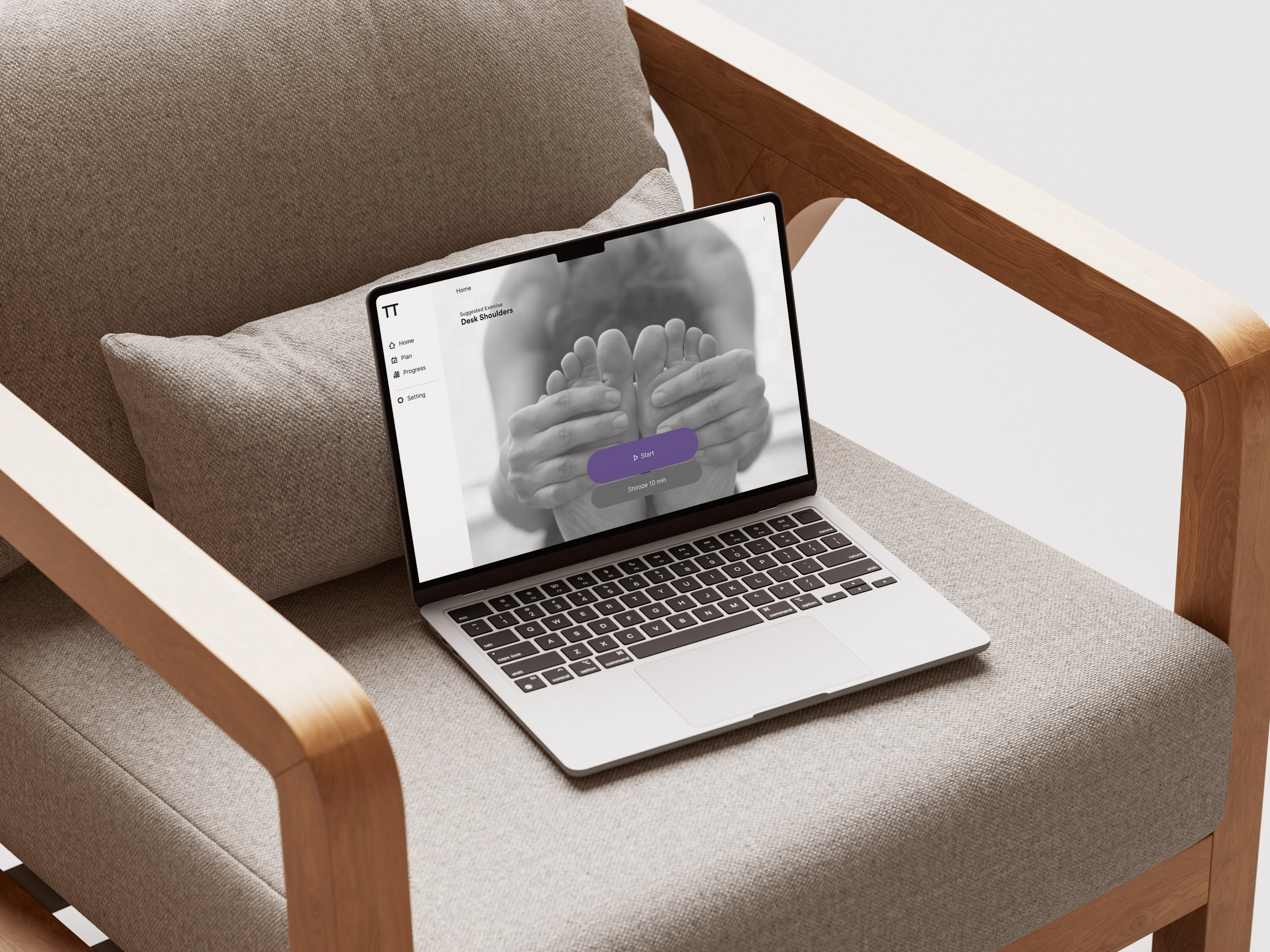
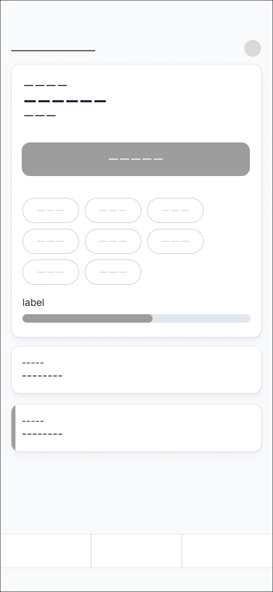
A calm setup in under a minute that fits your posture, place, and time.
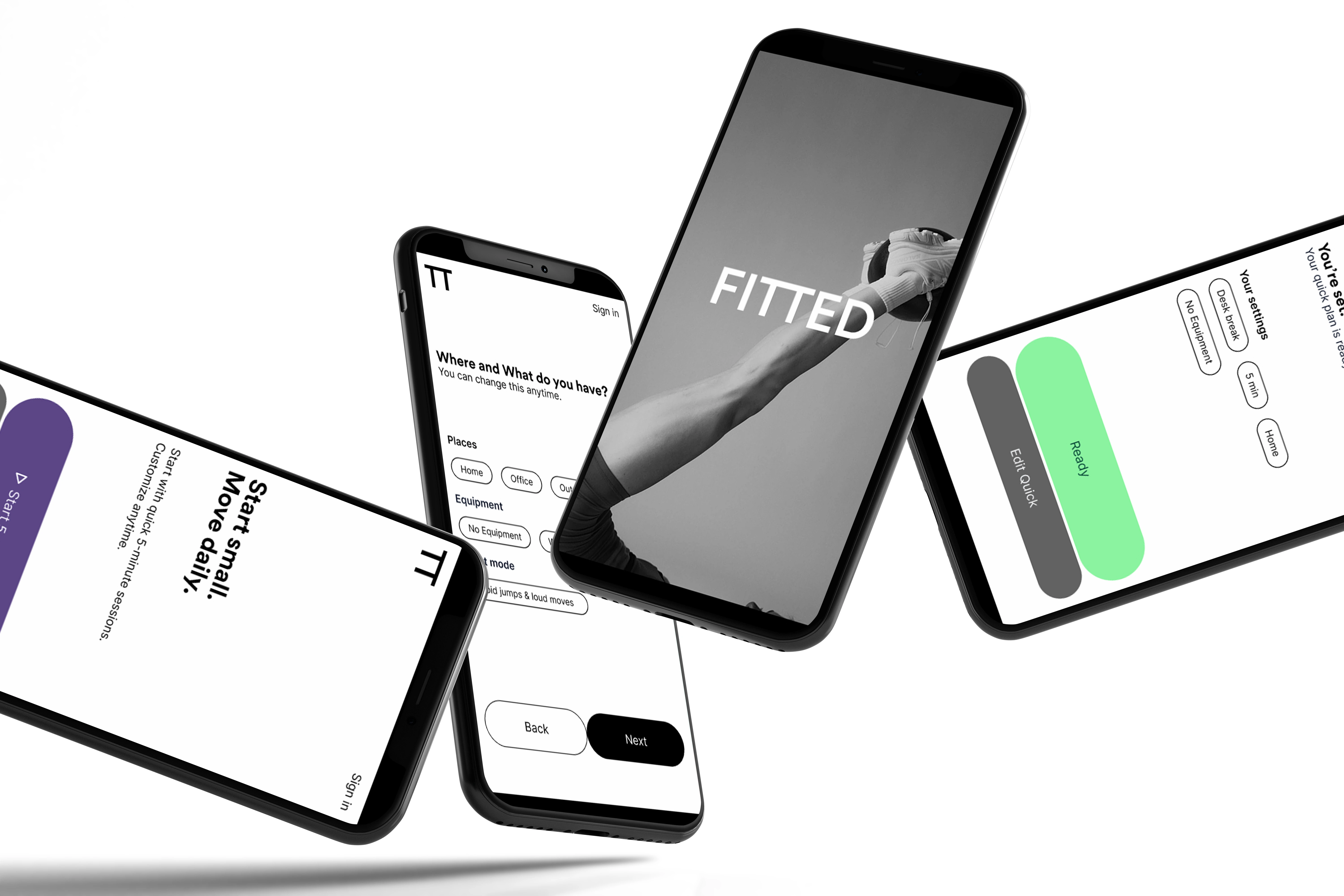
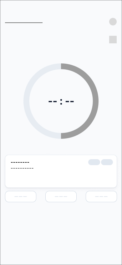
Start in one tap. “Next” where eyes land. Primary within thumb reach.
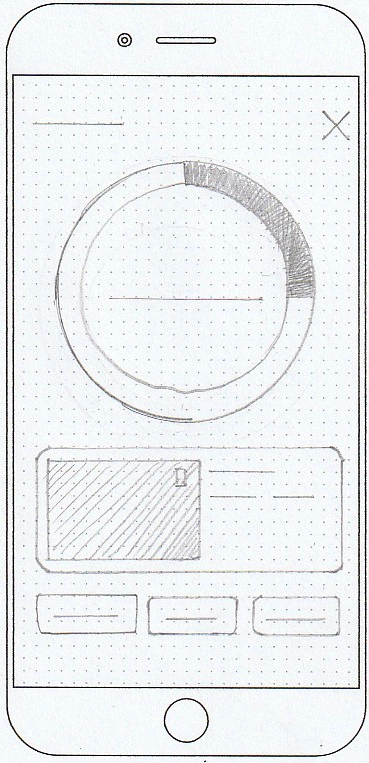
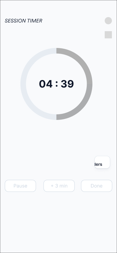
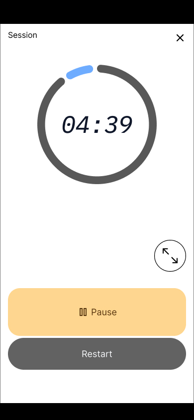
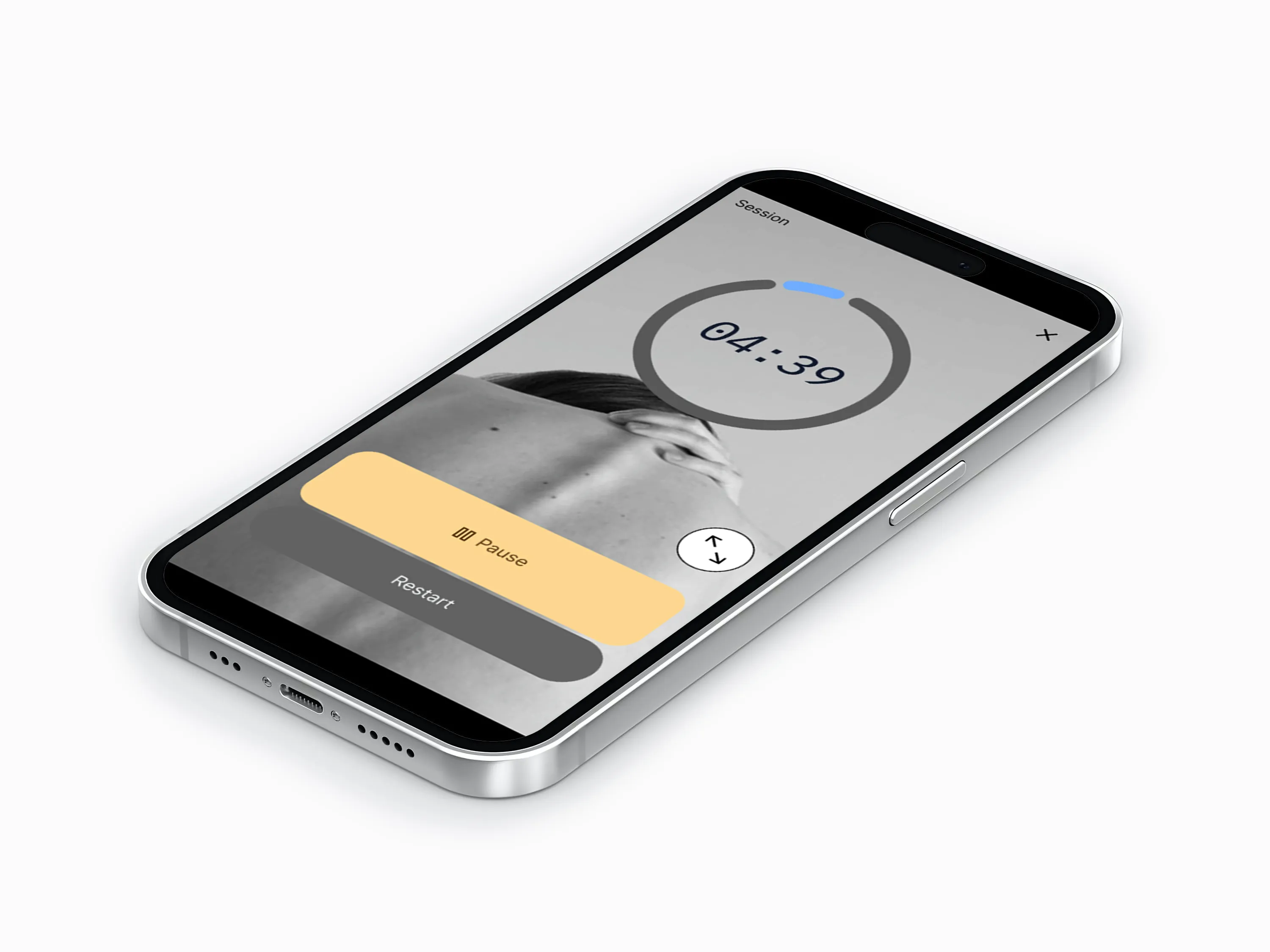
Large remaining time, one clear action (Pause or End). Haptics optional, feedback instant.
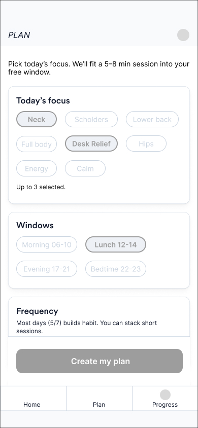
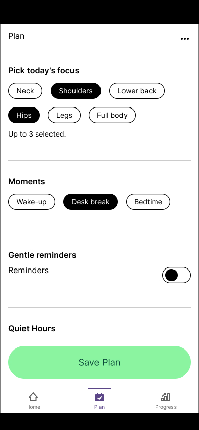
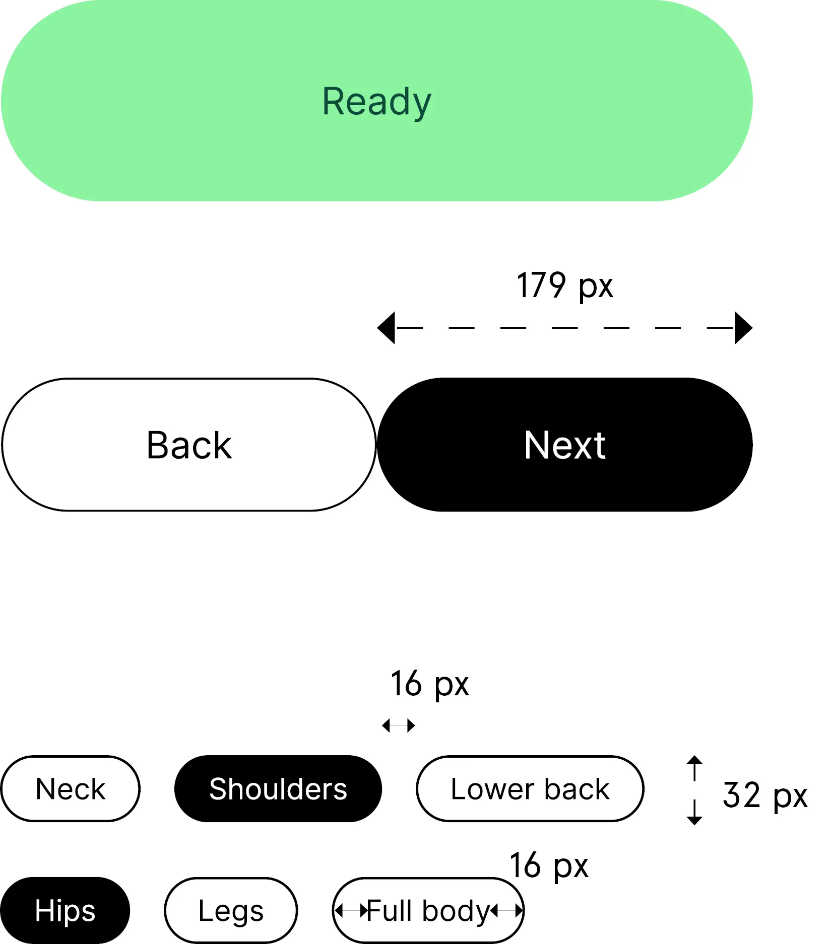
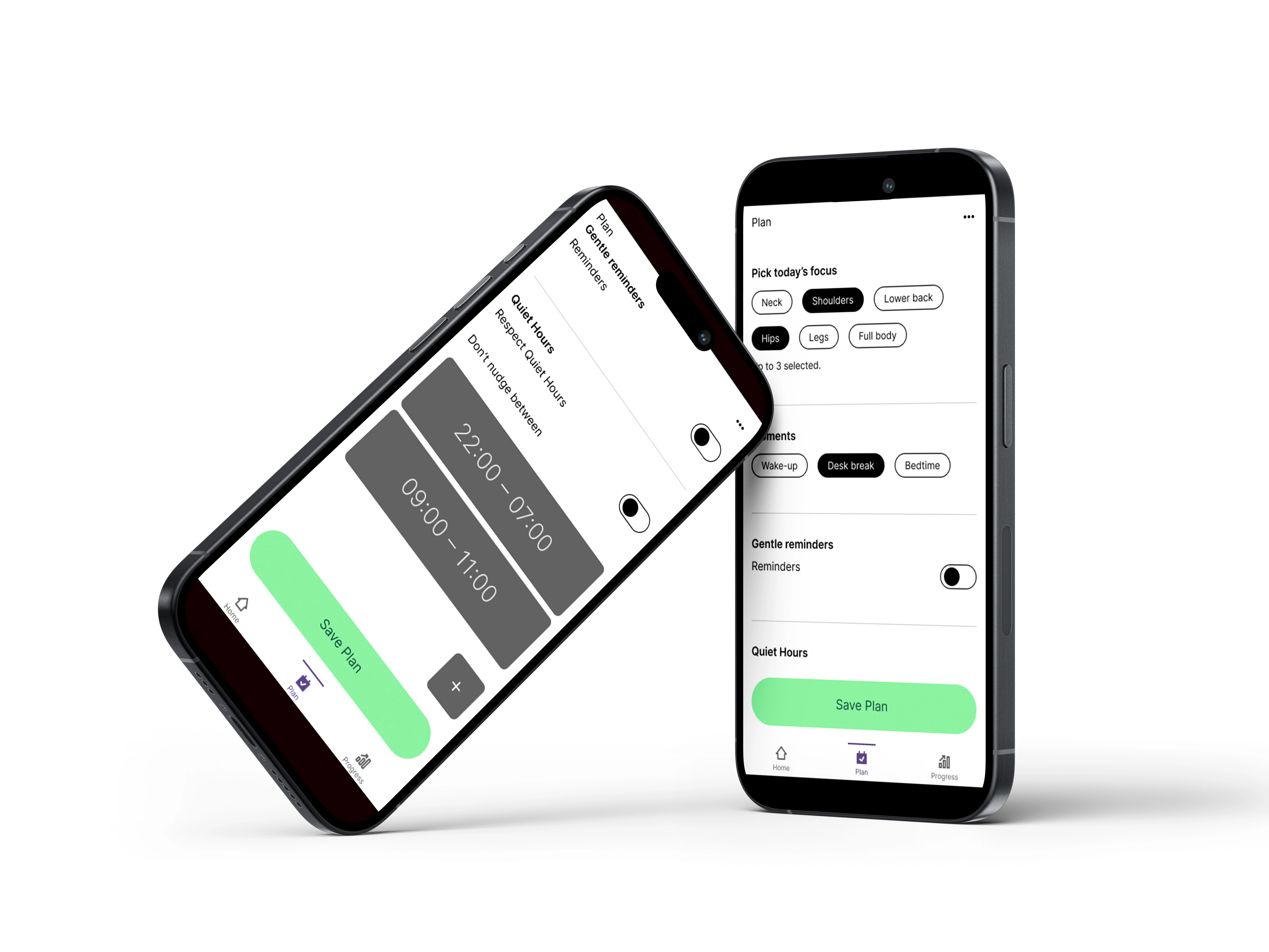
Set today fast with chips for focus and time. Add Quiet Hours so nudges stay silent when you’re busy.
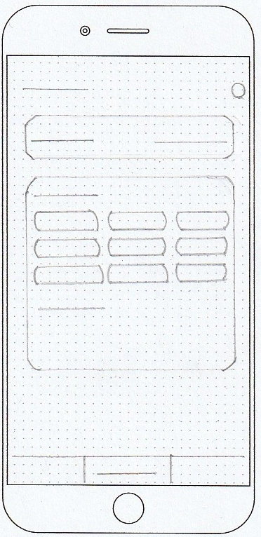
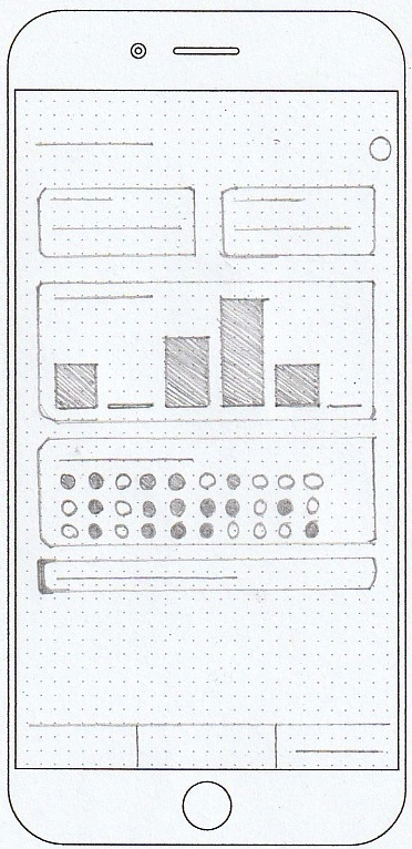
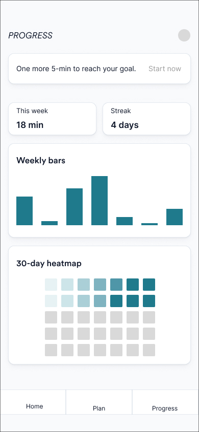
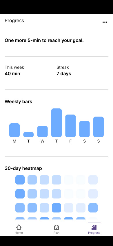
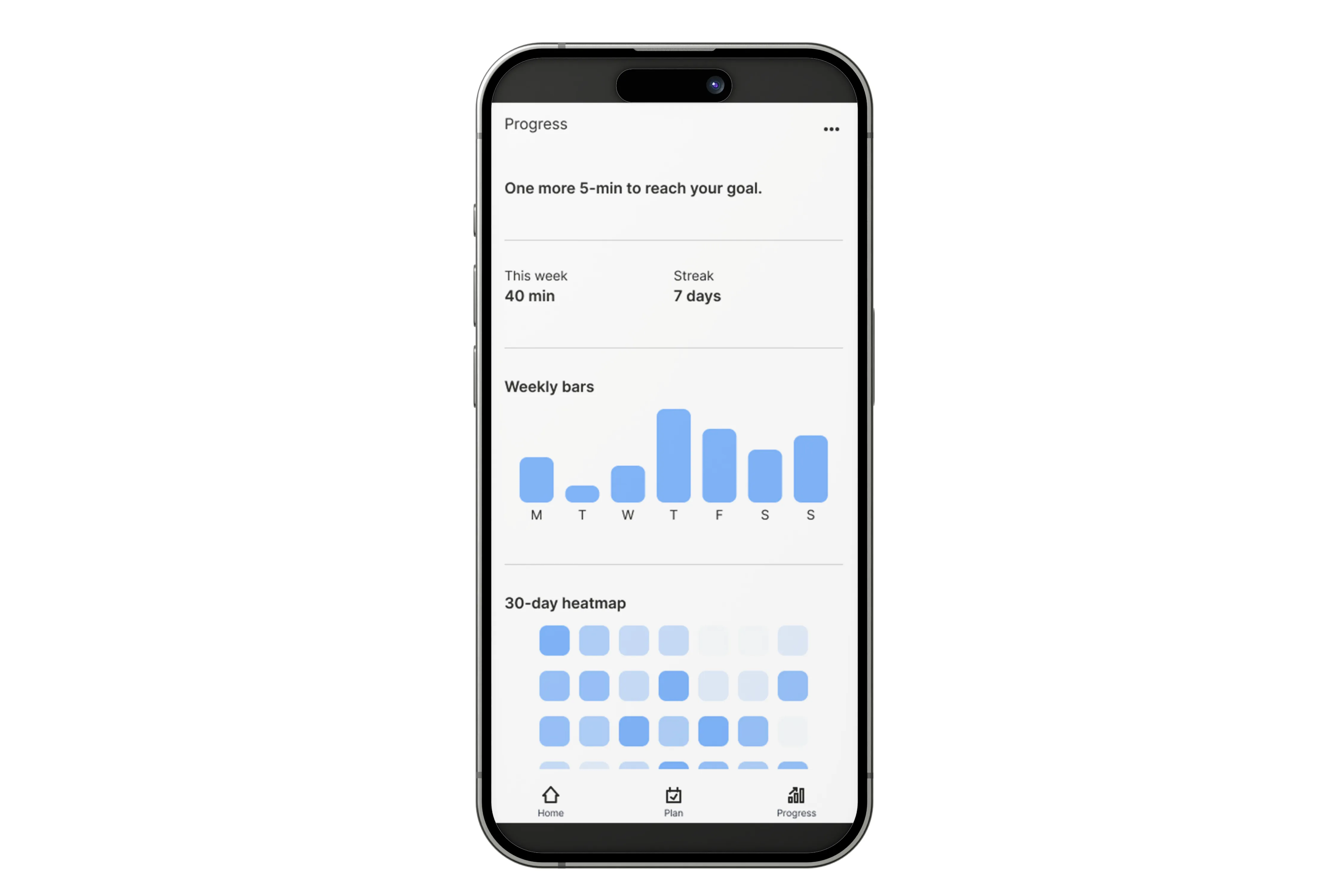
Low-saturation color, intensity only: weekly bars for volume, 30-day heatmap for consistency, daily log for context.
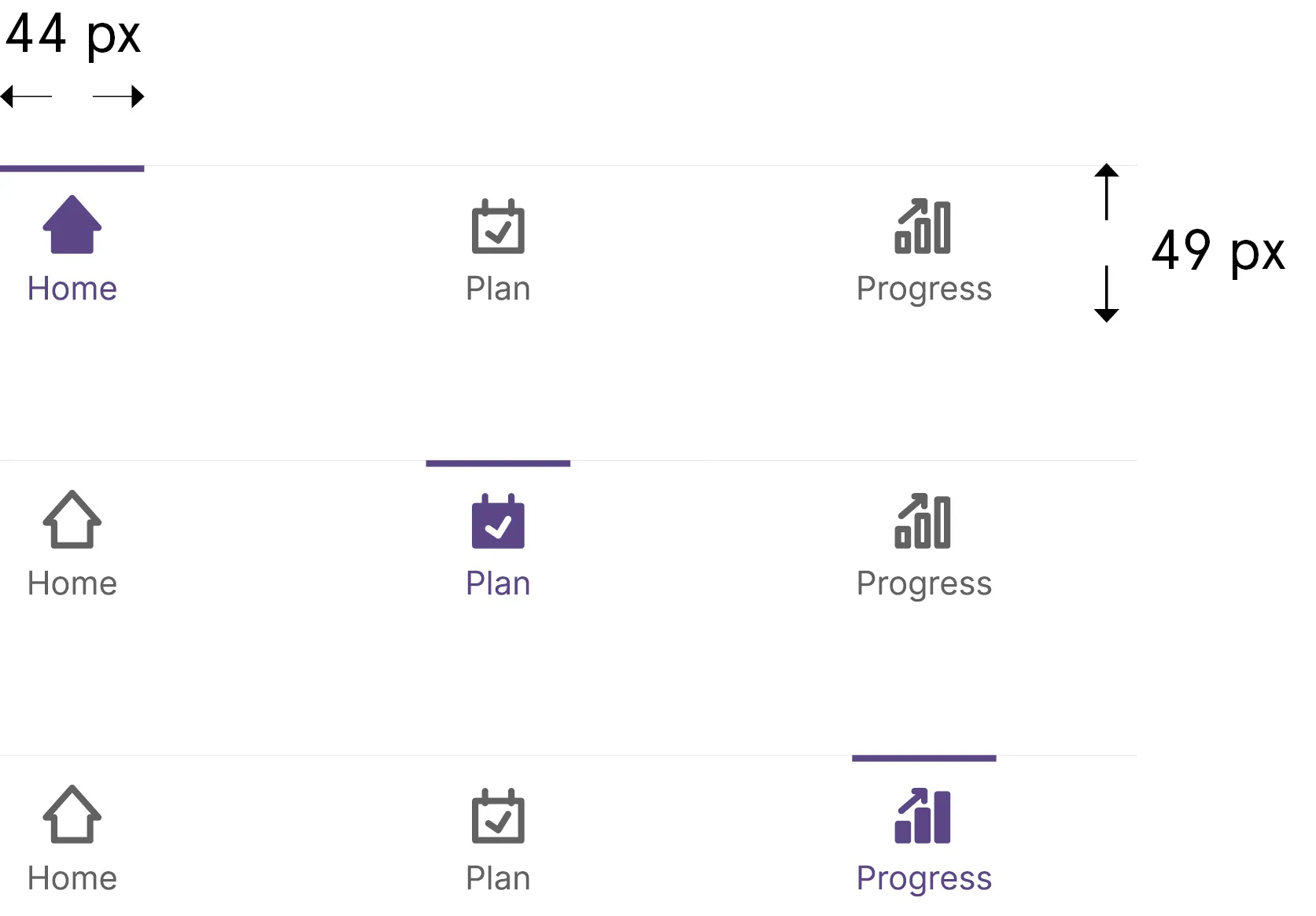
Fewer choices, faster starts. Three-tab bottom nav and a Start-first home cut time-to-action and boost daily repeats.
Speed decisions in glare and small spaces: calm colors, clear contrast, and a primary right where the thumb expects it.