Key UX Decisions
Decisions informed by outdoor usability testing to reduce uncertainty in real-world use.
Vela helps casual water-sports users make safe go/no-go decisions with real-time conditions and calm, personalized signals.
Decisions informed by outdoor usability testing to reduce uncertainty in real-world use.
How might we help casual users decide safely outdoors — without overwhelming them with fragmented, technical weather data?
Existing apps are cluttered and pro-oriented, and can feel unreliable in coastal or low-connectivity contexts.
Deliver real-time wind/wave conditions with user-controlled, calm signals in an interface that supports quick, confident decisions outdoors.
I focused on decision confidence outdoors. I prioritized usability findings by severity and frequency to ship the highest-impact fixes for one-handed outdoor use.
Across 7 interviews, open card sorting, and competitor review, a consistent pattern emerged: the problem wasn’t missing data—it was decision confidence.
Naomi Rossi, 30 — a Sardinia-based travel guide who needs fast, location-aware marine conditions while supporting beginners outdoors.


Rapid prototypes to validate navigation, comprehension, and one-handed use.
I ran remote and field usability tests and prioritized issues by severity and frequency. The highest-impact fixes improved clarity and confidence.
A/B tested onboarding copy. Version B won (7 vs 3) for speed and approachability → final hybrid adopted B’s tone with essential details.
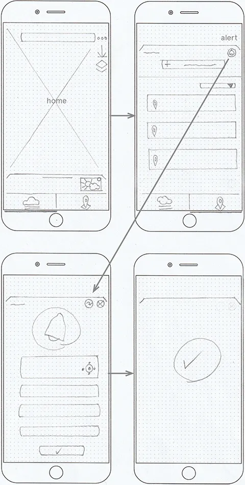
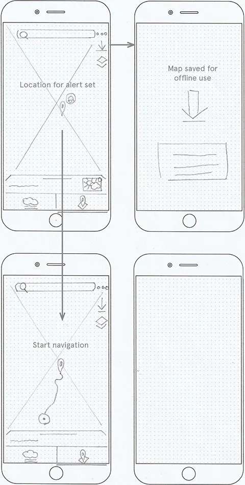
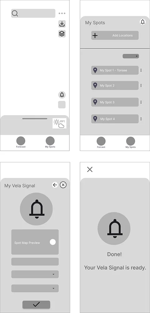
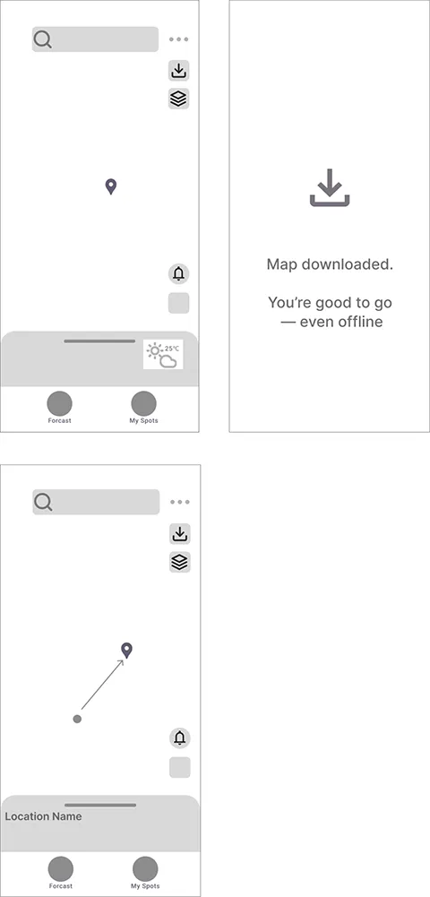
Key moments designed to reduce uncertainty and build trust in outdoor decisions.
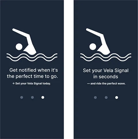
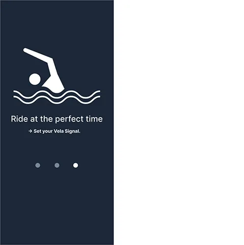
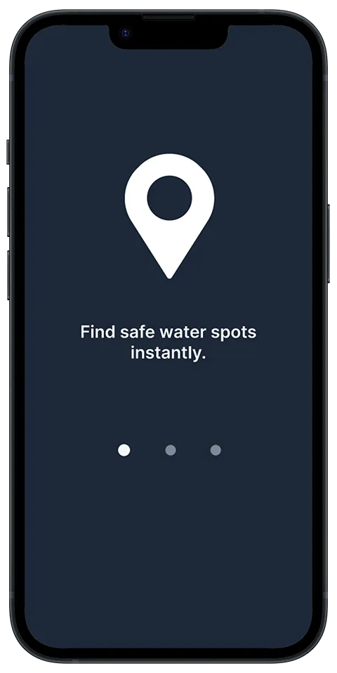
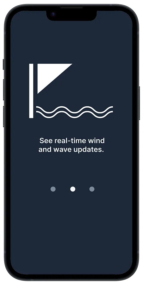
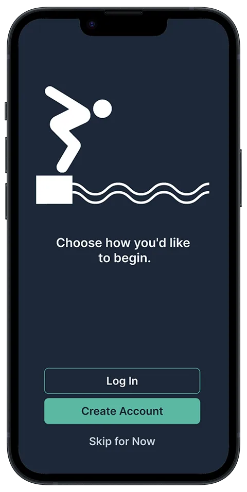
A calm, step-by-step start that builds confidence from the first screen.
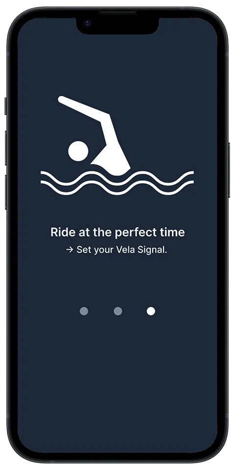
A calmer alternative to alerts. Personalized thresholds support confident decisions.
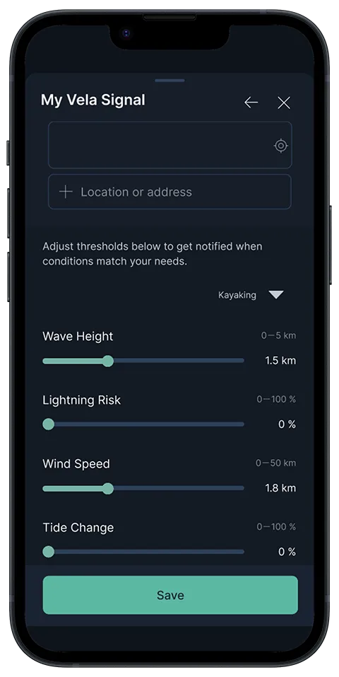
Empowering, not alarming. Vela reduces stress while improving clarity and control.
This approach improved comprehension and reduced hesitation in testing.
Vela reinforced a core lesson: trust is built through clarity. I focused on Simplicity, Immediacy, and Consistency.